UX UI RESEARCH
& DESIGN

I bridge the gap between user behavior and visual execution — translating behavioral data, usability testing, and user interviews into high-fidelity interfaces that are as rigorous as they are refined. Every design decision is validated before it becomes a pixel.

Insight & Data Architecture
Figma
Expert
Adobe CC
Expert
Canva
Advanced
Accessibility Design
Advanced
Prototyping
Expert
UX Design Strategy
Expert
User Research
Expert
Google Analytics 4
Expert
Looker Studio
Advanced
Search Console
Advanced
Usability Testing
Expert
Optimal Workshop
Advanced
01
UX Research UI Design Sitefinity Front-End Figma Looker Studio Card Sort Tree Test UX Analysis
UX / UI Design · Data Driven Research

American Association for Justice Homepage Redesign

UX Research UI Design Sitefinity Front-End Figma Looker Studio Card Sort Tree Test UX Analysis

A strategic homepage redesign for the American Association for Justice, one of the nation's largest trial lawyer organizations. The goal was to modernise the member experience, surface high-value resources more intuitively, and reduce the navigation friction that was causing members to abandon tasks or rely on personal contacts to find information.

The Challenge

User interviews revealed that engaged members — including board governors and caucus leaders who visit weekly — were working around the site rather than through it. One participant described acting as an informal "AAJ concierge" for fellow members who couldn't find basic information like convention hotel links. Another noted she would bypass the PAC contribution flow entirely and just email the staff contact because the site process was too complex. Critical resources were buried under inconsistent navigation that failed members across every experience level.

Behavioral Analysis

A Looker Studio analysis of the AAJ site established the quantitative baseline before any research began. With 46,728 active users and a 36.45% engagement rate (down 3.1%), the data showed a site struggling to convert visits into meaningful interactions. Several patterns pointed directly to the redesign priorities:

  • The login page appeared twice in the top 10 most visited pages (4,912 and 3,425 views), indicating members were repeatedly hitting authentication walls mid-task rather than accessing content smoothly.
  • The 404 page ranked 8th with 2,823 views — significant broken navigation sending members to dead ends during active sessions.
  • 73.8% of sessions came from desktop, yet the site's navigation complexity was creating friction even for experienced users on full screens.
  • Site search data revealed members actively searching for "scholarship," "Washington update," and "leadership academy" — content that existed but was not surfaced prominently enough to be found through navigation alone.
  • Event registrations and publications drove the majority of conversions, yet the PAC contribution flow showed an 18.8% drop in purchases — consistent with what user interviews later confirmed about members bypassing the flow entirely.
Research

Behavioral data framed the hypotheses. Qualitative and quantitative research then validated them. Two moderated user interviews with active AAJ members — a 6-year attorney on the New Lawyers Division and Board of Governors, and a 15-year member and former Membership Oversight Chair — surfaced the human stories behind the drop-off numbers. Supplemented with an Optimal Sort card sort of 88 participants (34 completed, median time 18:58) to map how members mentally categorize AAJ's content. A follow-up tree test with 28 participants validated the proposed architecture, achieving 79% task success and 83% directness before any design work began.

Key Findings

The three layers of research converged on the same friction points. Members were hitting login walls mid-task — confirmed by both the double login page in top pages and interview participants describing authentication interrupting the PAC contribution flow. The 404 rate signaled broken pathways that the IA restructure needed to eliminate. Site searches for scholarship and leadership content confirmed that members knew what they wanted but couldn't find it through navigation — validating the card sort finding that content groupings didn't match member mental models. User interviews added what analytics couldn't show: a board governor describing herself as an informal "AAJ concierge" for other members, and a 15-year member bypassing the PAC flow entirely to email staff directly.

The Design

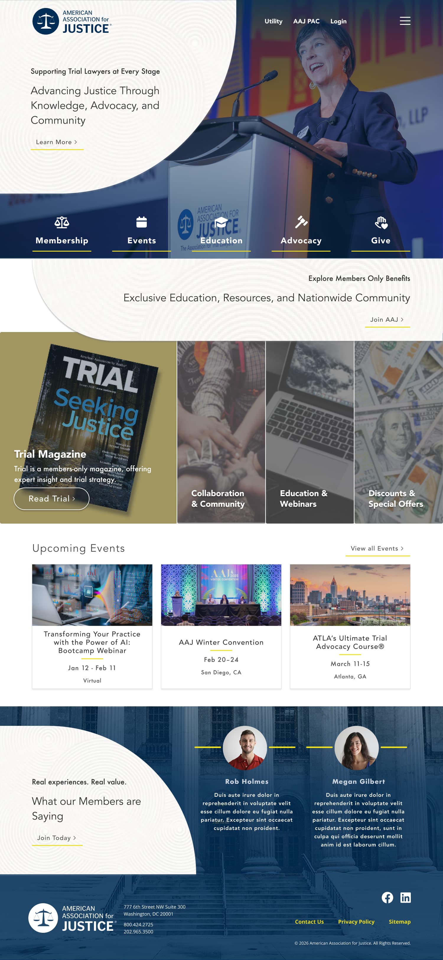
The unified events surface directly addresses the calendar fragmentation members described, and the PAC contribution flow was restructured to show members their current tier — eliminating the confusion that was driving drop-off. The high-fidelity Figma prototype restructures the homepage around the three primary member needs surfaced in research: find and register for events, access resources, and engage with the community. A modernised component system, clearer CTAs, and a refined visual hierarchy bring the design in line with the weight and credibility of the AAJ brand while significantly reducing cognitive load.

Research Validation

Tree testing with 28 participants achieved a 79% overall navigation success rate and 83% directness — users found the correct destination without backtracking. The high directness score is particularly meaningful for an organization whose members were previously navigating by memory or calling staff for help.

Status

Design complete and research-validated. Development currently underway. Full Figma prototype, Optimal Workshop results, and UX analysis report available for viewing.

AAJ full design
Expand
02
UX Research UI Design Figma Card Sort Tree Test
UX / UI Design · Homepage

Computing Research Association Homepage Redesign

UX Research UI Design Figma Card Sort Tree Test

A research-backed homepage redesign for the Computing Research Association — the leading organization connecting academic, industry, and government computing research communities. The goal was to clarify the site's information architecture and better serve a highly technical, diverse audience navigating research resources, events, and policy content.

The Challenge

CRA serves multiple distinct user groups — researchers, educators, students, and policymakers — each with different goals and entry points. The existing homepage treated all visitors the same, resulting in a cluttered hierarchy that buried high-value content like upcoming events, policy initiatives, and research programs under competing visual weight.

Research

Ran an Optimal Sort card sort with 111 participants, 70 completing the study (63% completion rate) with a median time of 12:32. The scale of participation across the US and Canada provided statistically meaningful signal on how the computing research community mentally categorizes CRA's content. A follow-up tree test with 32 participants validated the proposed information architecture, achieving a 73% overall navigation success rate and 83% directness — meaning most users reached the correct destination without backtracking.

The Design

The high-fidelity Figma prototype applies the validated IA to a modernised visual system, cleaner section hierarchy, stronger event and news prominence, and a more authoritative typographic treatment aligned with CRA's position as a credibility-first organization. Accessibility was built in from the start with a color system meeting WCAG AA standards throughout.

CRA full design
Expand
03
UX Research UI Design Figma Looker Studio Card Sort Tree Test
UX / UI Design · Data Driven Research

NAPFA Homepage Redesign

UX Research UI Design Figma Looker Studio Card Sort Tree Test

A research-backed homepage redesign for the National Association of Personal Financial Advisors — a leading professional organization for fee-only financial advisors in the United States. The goal was to resolve a fundamental audience conflict embedded in the site's existing structure and design an experience that serves both consumers seeking advisors and member advisors managing their professional resources.

The Challenge

Behavioral data revealed that NAPFA's site was serving two fundamentally different audiences with a single undifferentiated experience. 64.1% of traffic came from consumers searching for a fee-only financial advisor — people who had never heard of NAPFA and arrived through generic queries like "fiduciary financial advisor" and "fee only financial planner." The remaining traffic came from member advisors accessing professional resources and event registrations. The existing homepage failed both groups by treating them identically, resulting in a 53.73% engagement rate that masked significant drop-off on consumer-facing pathways.

Behavioral Analysis

A Looker Studio analysis of site performance established the quantitative baseline and surfaced the strategic tension that drove the redesign. With 172,376 views, 46,148 active users, and a 53.73% engagement rate, up 3.2%, NAPFA's overall metrics looked healthy. But the content category breakdown told a more complex story:

  • The Find an Advisor page led all traffic with 50,003 views — more than double the homepage's 22,550, confirming that consumer advisor search was the primary use case driving the majority of visits.
  • The branded vs. generic search split showed 51.4% of search traffic came from consumers who didn't know NAPFA existed, searching terms like "fiduciary financial advisor" (63,226 impressions, 0.25% CTR) and "fee only financial advisor" (32,796 impressions, 0.34% CTR). Low CTRs on high-impression generic terms signaled a missed acquisition opportunity.
  • Membership page views had dropped 100% — members were not engaging with membership content through the homepage at all, navigating directly to specific resources instead.
  • CE page views were down 18.5%, despite continuing education being a core member need, suggesting that education content was not surfaced prominently enough in the current structure.
  • The conference landing page carried a 78.71% bounce rate — visitors arriving for event information were leaving immediately, indicating the page wasn't meeting the expectations set by external links and search results.
Research

Behavioral data defined the two audience problems. Quantitative research then validated how to solve them. An Optimal Sort card sort with 83 participants (46 completed, 55% rate, median time 10:22) mapped how both consumers and member advisors mentally categorize NAPFA's content, revealing that the two groups organized information differently and needed distinct entry points. A follow-up tree test with 85 participants validated the proposed dual-audience architecture, achieving a 70% task success rate and 85% directness before any design work began.

The Design

The high-fidelity Figma prototype resolves the audience conflict by establishing two clear pathways from the homepage — one oriented toward consumers finding an advisor, one toward members accessing professional resources. The consumer pathway is positioned as the primary entry point given the traffic data, with a prominent advisor search tool above the fold. The member pathway surfaces CE content and upcoming conferences directly, addressing the drop-off in education engagement. A refined visual system brings the design in line with NAPFA's authority as the standard-bearer for fee-only financial advice.

Research Validation

Tree testing with 85 participants achieved a 70% task success rate and 85% directness — the highest directness score across all redesign projects in this portfolio. Users navigated to the correct destination without backtracking at a rate that confirms the dual-pathway architecture resolved the navigation ambiguity present in the existing site.

Status

Design complete and research-validated. Development currently underway. Full Figma prototype, Looker Studio report, and Optimal Workshop results available to view.

NAPFA full design
Expand
04
UX Research UI Design Figma Card Sort
UX / UI Design · Data Driven Research

Georgia Society of CPAs Homepage Redesign

UX Research UI Design Figma Card Sort

A strategic homepage redesign for the Georgia Society of CPAs, focused on enhancing professional resource accessibility and membership engagement. Research findings were translated directly into interface decisions, producing a redesigned homepage that surfaces critical tools more intuitively and reduces friction for members navigating professional resources.

The Challenge

The organization faced challenges with information architecture where high-value professional resources were obscured by an inconsistent visual hierarchy. This friction prevented members from efficiently locating critical documentation and membership tools, impacting overall site engagement.

Research

The card sort results directly validated the navigation restructure before any high-fidelity work began. 22 of 37 participants completed the study with a median time of 11:21 — time-on-task data and abandonment patterns identified the specific groupings causing friction in the existing structure, which the redesigned IA resolved directly.

The Design

The high-fidelity Figma prototype translated card sort findings directly into interface decisions:

  • Data-Informed IA: A restructured navigation system based directly on validated card sort results to ensure intuitive user flows.
  • Strategic UI Components: Clear, conversion-oriented CTAs designed to drive qualified leads and resource engagement.
  • Accessibility Standards: A refined color system and typography scale aligned to WCAG AA standards for professional inclusivity.
Status

Design complete and research-validated. Development currently underway. Full Figma prototype and Optimal Workshop card sort results available for viewing.

GSCPA full design
Expand